Guides · Streetwear
How to Tell if Your Off-White Is Real or Fake (2026)
Off-White — Virgil Abloh's label — rests on a set of recognizable house devices: quotation-mark text in a Helvetica-like font, the arrows logo with precise geometry, and diagonal stripes at a consistent angle. The original and the replica part ways first on typography: a near-miss typeface, broken kerning, and crooked arrows give a fake away the fastest. The zip-tie and tags help, but they are mass-copied, so it's the font and the print geometry that decide it.
Real vs fake Off-White: comparison table
Data current as of July 2026. Replicas evolve, so judge by the combination of signs — never a single one.
| Sign | Authentic | Fake |
|---|---|---|
| Logo typography | Quotation-mark text ("SCULPTURE", "SHOELACES," etc.) set in the exact Helvetica-like font: even kerning, correct stroke weight and letter height. | A near-miss typeface (close but not it), broken kerning, letters too thin or too heavy, a wandering wordmark. |
| Arrows logo | The diagonal arrows at a calibrated slant angle, with an exact number of parallel lines and equal gaps; the geometry is symmetrical. | A missed angle, an extra or missing line, uneven gaps, crooked or lopsided arrows. |
| Diagonal stripes | Stripes run strictly parallel at a consistent angle, with equal stripe and gap width; color registration is exact and boundaries are sharp. | A drifting angle, stripes of varying thickness, uneven gaps, ghosting and a white gap between colors. |
| Zip-tie | The signature zip-tie (red or seasonal) with sharp "OFF-WHITE" lettering — treated as a release detail, not proof of authenticity. | Blurry lettering on the tie, the wrong color/shade; and since the tie is mass-copied, it confirms nothing on its own. |
| Tags and Made in Italy | The woven Off-White label and country tag (Made in Italy/Portugal) with the right font, layout, and a straight seam; the "c/o Virgil Abloh" wording in the exact typeface. | Blurry lettering, the wrong font or country, a "one-size-fits-all" label, a crooked seam, and signs of re-stitching. |
| Print, seams and cotton | The print is soft and thin, fused to the fabric and stretching with it; dense cotton holds shape, seams are straight, hems are tidy. | A thick plastic ink layer that cracks along a fold, thin see-through fabric, crooked seams and uneven hems. |
The difference is in the details — drag the slider
Typical differences in workmanship: stitching consistency, edge finishing, detail quality. Left — factory quality, right — common replica flaws.
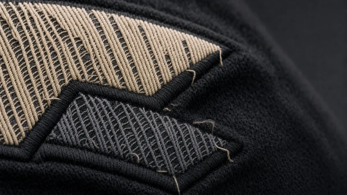 Replica
 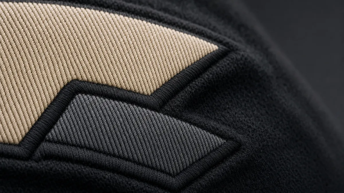 Authentic
 1. Logo typography
Authentic: Quotation-mark text ("SCULPTURE", "SHOELACES," etc.) set in the exact Helvetica-like font: even kerning, correct stroke weight and letter height.
Fake: A near-miss typeface (close but not it), broken kerning, letters too thin or too heavy, a wandering wordmark.
2. Arrows logo
Authentic: The diagonal arrows at a calibrated slant angle, with an exact number of parallel lines and equal gaps; the geometry is symmetrical.
Fake: A missed angle, an extra or missing line, uneven gaps, crooked or lopsided arrows.
3. Diagonal stripes
Authentic: Stripes run strictly parallel at a consistent angle, with equal stripe and gap width; color registration is exact and boundaries are sharp.
Fake: A drifting angle, stripes of varying thickness, uneven gaps, ghosting and a white gap between colors.
4. Zip-tie
Authentic: The signature zip-tie (red or seasonal) with sharp "OFF-WHITE" lettering — treated as a release detail, not proof of authenticity.
Fake: Blurry lettering on the tie, the wrong color/shade; and since the tie is mass-copied, it confirms nothing on its own.
5. Tags and Made in Italy
Authentic: The woven Off-White label and country tag (Made in Italy/Portugal) with the right font, layout, and a straight seam; the "c/o Virgil Abloh" wording in the exact typeface.
Fake: Blurry lettering, the wrong font or country, a "one-size-fits-all" label, a crooked seam, and signs of re-stitching.
6. Print, seams and cotton
Authentic: The print is soft and thin, fused to the fabric and stretching with it; dense cotton holds shape, seams are straight, hems are tidy.
Fake: A thick plastic ink layer that cracks along a fold, thin see-through fabric, crooked seams and uneven hems.
Popular Off-White models
Model-by-model checks — what to look at on each:
Where to inspect
The key zones to photograph and check on this type of item — a schematic, not a product photo.
- 1Neck label and tags
- 2Print and its printing
- 3Stitching and hem
- 4Shoulder and sleeve seam
- 5Fabric and weight
How to photograph your Off-White for a check
Shoot in daylight, avoid glare, keep focus sharp. You need 5 angles:
- 1 Full item (front with logo)
- 2 Quotation-mark text close-up
- 3 Arrows or diagonal stripes
- 4 Zip-tie and Made in Italy tag
- 5 Neck tag and "c/o Virgil Abloh"
How to read the result
The AI returns a verdict with a confidence score:
- 75–100% — Authentic: high confidence the item is genuine.
- 60–74% — Likely authentic: probably genuine with minor concerns.
- 40–59% — Uncertain: the photos are not conclusive — retake or add angles.
- 25–39% — Likely fake: several red flags.
- 0–24% — Fake: clear signs of a replica.
Check your Off-White right now
Snap photos of your item and get an AI verdict with a confidence score in about a minute.
FAQ
What's the fastest Off-White tell?
Logo typography. The real thing uses the exact Helvetica-like font with even kerning, while replicas grab a near-miss typeface and mangle the spacing. The same principle applies to the arrows and diagonal stripes: crooked geometry, a missed angle, or uneven gaps give a fake away even with clean fabric.
Does the red zip-tie prove authenticity?
No. The zip-tie is the single most copied Off-White element, and rep factories reproduce it first. It's just a detail of a specific release. Authenticity is decided by logo typography, arrow and stripe geometry, and print quality — not by the presence of the tie.
How many stripes and at what angle?
The exact stripe count and angle depend on the specific drop, so there's no "universal" value — cross-check against reference photos of that release. What matters is that the stripes are strictly parallel and the stripe and gap width are equal across the whole block.
Is a photo of the logo enough?
The logo is the strongest single signal, but a reliable verdict comes from the combination: typography + arrows/stripes + tags and "c/o Virgil Abloh" + print quality. The app tells you which angles to shoot and cross-references the piece against the release.